The Art Institute of Chicago Museum Shop
While working at the Art Institute of Chicago2017–2018
The Art Institute of Chicago has a shop that carries products with the same unique tastes and values as the works within the museum. While the shop has two physical locations within the museum, a large percentage of sales occurred through the shop website. In alignment with our Art Institute Website Redesign, we took the opportunity to reminagine the shop’s brand and e-commerce strategy.
Visit the site ︎
See all my Art Institute work ︎

The new shop website mirrors many aspects of the new Art Institute website—generous negative space, big images, and quick-search terms for browsing the assortment that align with the aesthetic values of the shoppers. While we were able to use the design and functionality of the Art Institute website as a jumping off point, we wanted the shop to have it’s own distinct feel, and to conceptually challenge ourselves into thinking about how the values of our museum should translate into an e-commerce experience.
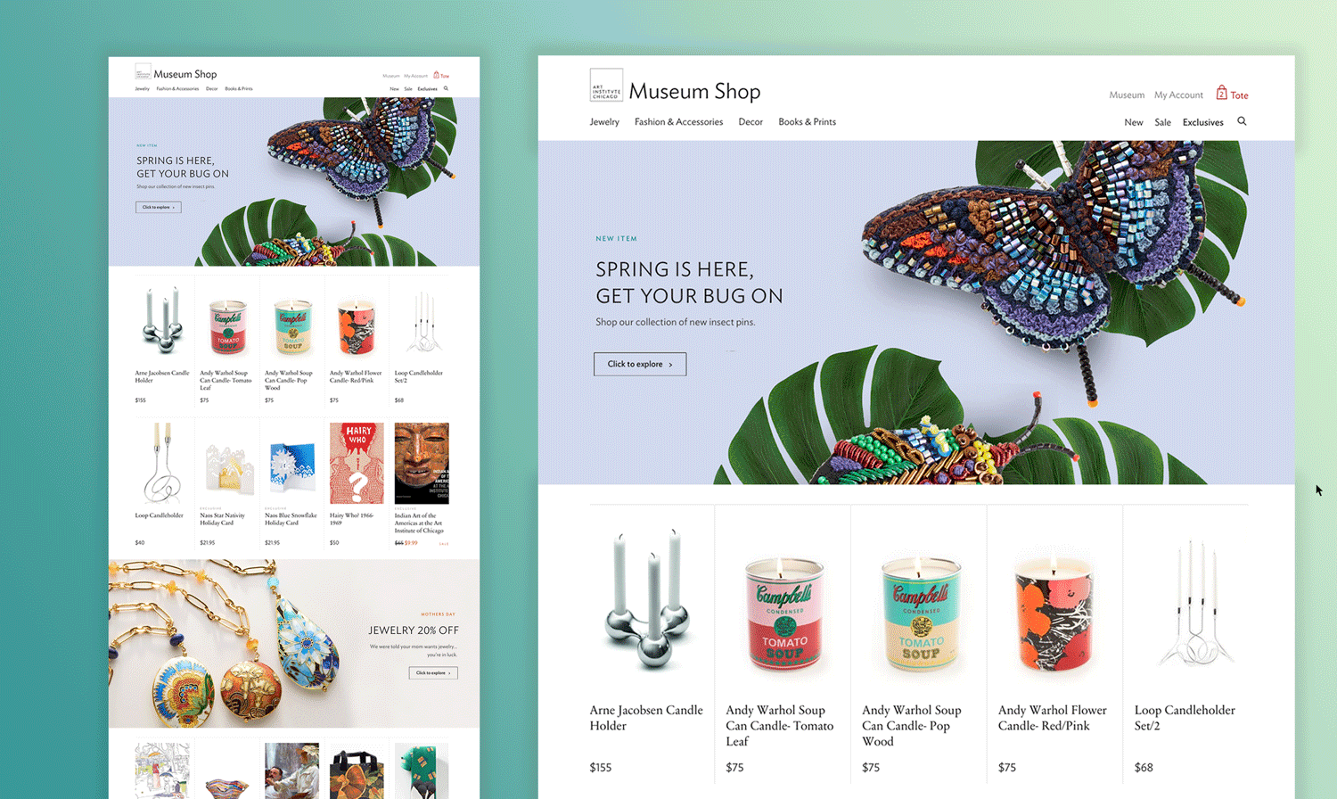
A main tenant of the site was getting shoppers to seeing product sooner. This meant having an accessible product stream immediately on the homepage, as well as having narrative-focused banner ads that reveal content and product teasers before advancing the user to another page.
These banner ads are a manifestation of one of the more informative insights from our strategy: stories that highlight the maker’s process or the museum shop’s exclusive relationship with the maker were the biggest appeal for shoppers. This strategy permeates several areas of the site, including an “Exclusives” page in the main nav that surfaces all of the products you can only find at the Art Institute of Chicago’s museum shop.
Another area this is prominent is on the product page itself. If there is a related story—about the maker, the artistic inspiration, or the trend which the product aligns with—it appears adjacent to the product. Clicking through to the story, shoppers can read more about the topic and see all of the related products immediately on the page.

PROCESS
The museum shop website was once considered decisively separate from the museum. However, with its evolution, its strategy changed into trying to integrate as much as possible to be seen as adjacent to the prestige of the museum and it’s iconic collection.
The website had been designed, built, and maintained since it’s inception by a local agency called Webitects. Webitects’ nimble team acted as our development partners on the project, while our team—specifically, myself and Director of Experience Design Michael Neault—owned the new design.
See the starting point of the museum shop website below:


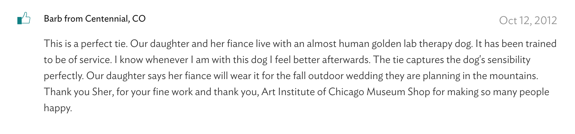
The context for the museum shop makes it an interesting subject for research. Shoppers had an intensely personal connection to the shop, mostly evident through the incredibly heartfelt comments that can be found on the product pages across the site.
We defined a strategy that would help us grow our audience with younger segments, while not isolating our core shoppers. While this had implications for how the site would look and function, it also revealed that the admiration for visual art as the obvious overlap of the thresholds of our shoppers.
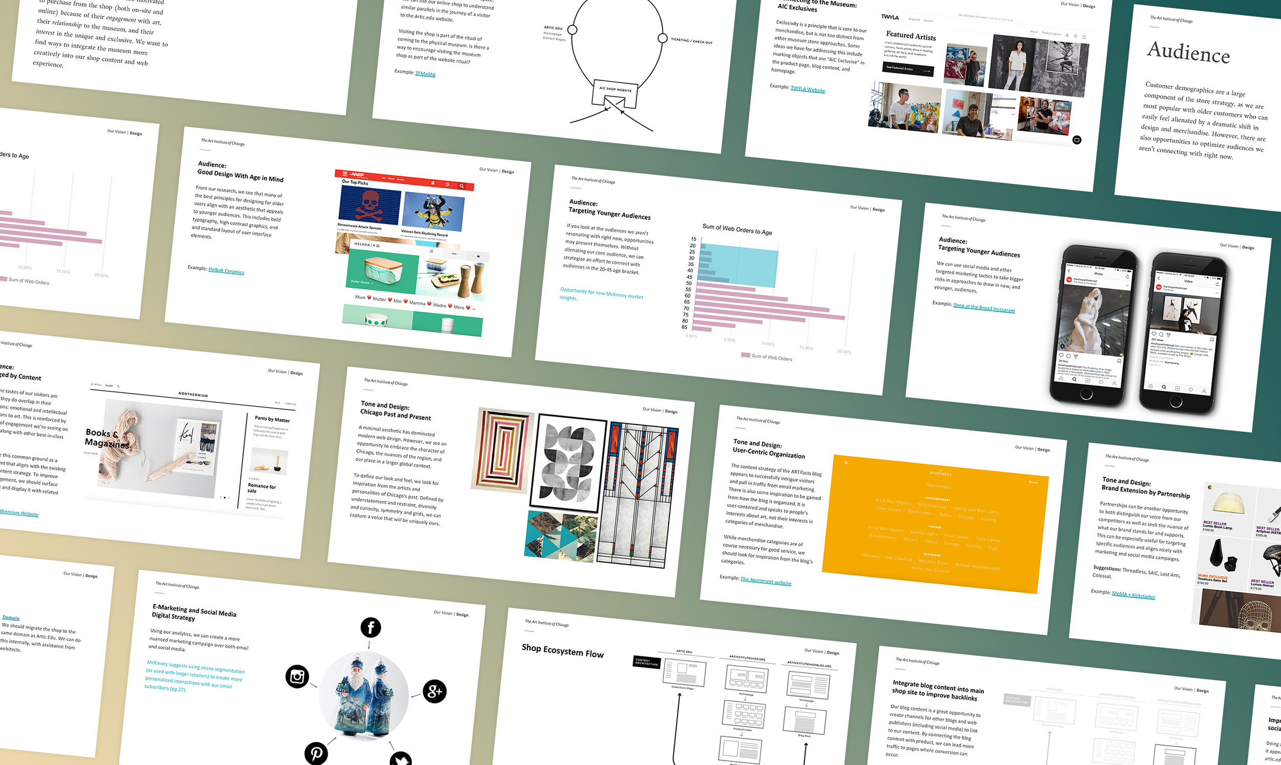

The first phase of the shop redesign was addressing all of the most urgent design and user experience issues and starting to line up the workflow to accommodate what would be the new design. New art direction was issued to product photographers while the shop adjusted their content strategy.
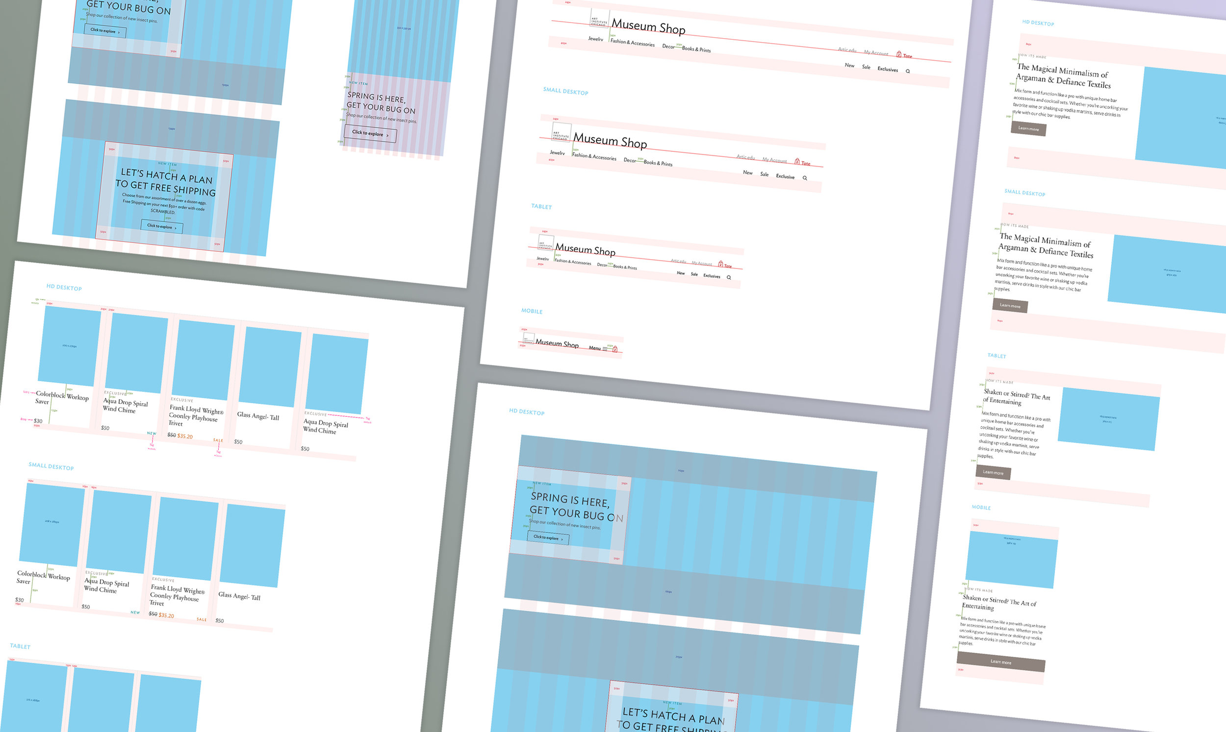
With the final Art Institute website designs in place, we leveraged our new digital design system to bring consistency across the two sites. The visual design decisions were communicated to our Webitects through Sketch files and thorough design documentation, such as this comp that demonstrated the composition, styles, and spacing as the page was scaled responsively.
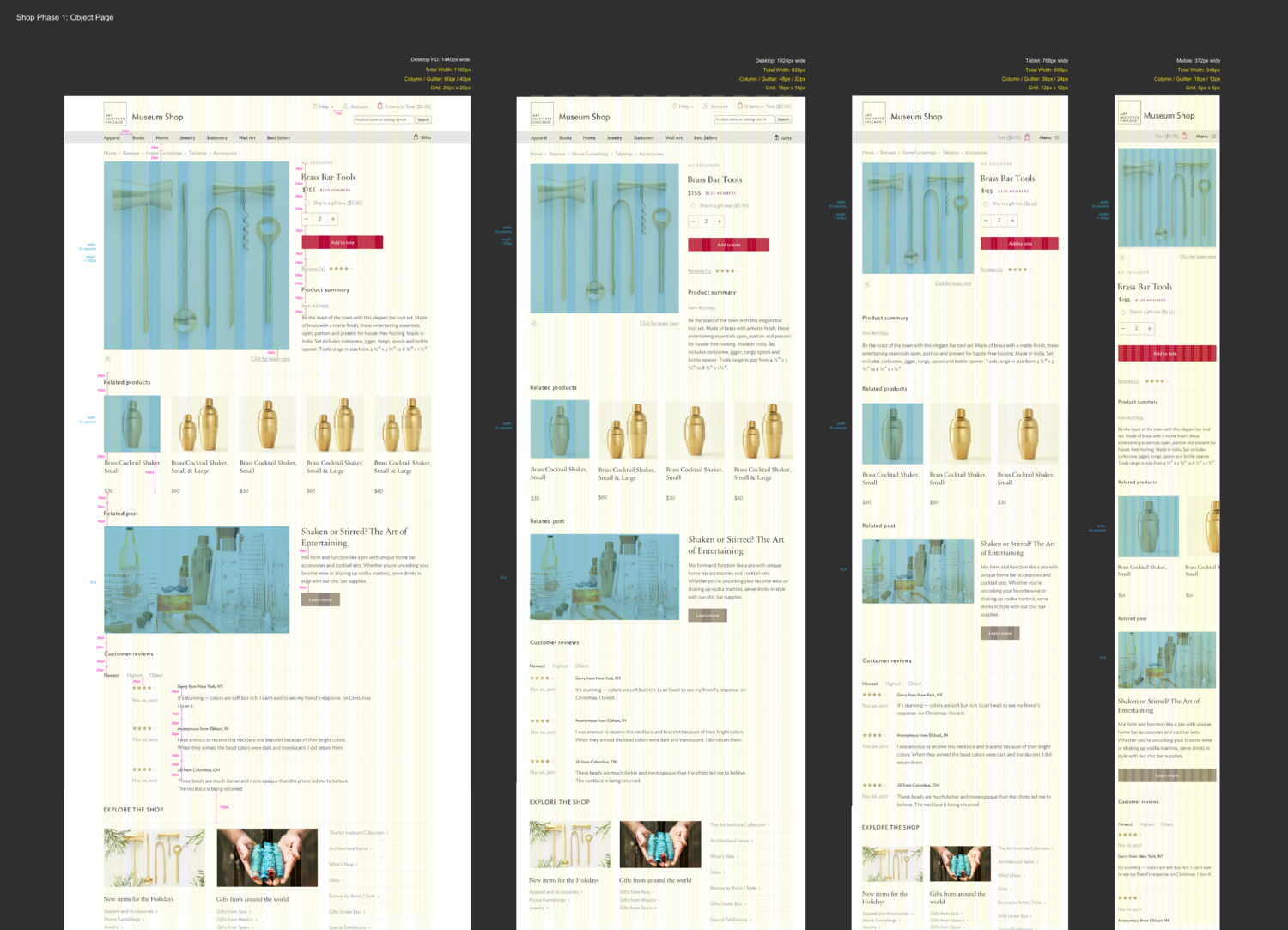
This documentation, and the dozens of hours of subsequent VQA, were the most diligent work that I had ever done on a visual design project. In order to anticipate how the design would be implemented, I needed a thorough understanding of how Webitects was planning to build the site. Similar to the Art Institute website, the content was considered atomically, with modules of content that had different scales and manifestations throughout the site.
In the end, the vigor that was brought to the shop redesign paid off, as I was able to use the site design as the first extension of the design system as defined by the Art Institute website. The intuition I gained on the brand language would pay off as we made updates to the main website, allowing me to spot inaccuracies and effortlessly reference other areas of the two sites to use as precedent for updates.
The shop now has it’s own visual identity, manifested through the shop website and documented to use for future design needs, whether in print or environmentally within the shop. The shop now visually complements and aligns with the museum’s identity, allowing those who feel connected to the Art Institute to bring a the spirit of the Collection home with them.

The shop team is lead by Kirstie Lytwynec, Vice President of Retail, and supported by Sarah Raettig and Anne Chernik. Sarah and Anne particularly have gone above and beyond to educate themselves on the ins and outs of digital design best practices while knowing their customers best.
Josh Andrews was the project manager for this project, who balanced it elegantly with the behemoth that was the Art Institute of Chicago website.
Executive Creative Director of Experience Design Michael Neault provided direction and leadership on how to navigate and communicate an e-commerce project through the lens of a museum.
Webitects, and specifically Design Director Nick Rougeux, were incredibly thorough, responsive, optimistic, and encouraging. They will continue to maintain the site with the Shop team.