The Art Institute of Chicago Website Redesign
In September 2015, the Art Institute of Chicago recruited me to kick-off an internal discovery phase for the collections portion of their website, which had not been updated since 2008. Three years later, we launched a full redesign of the entire web presence, including the museum shop website.
Visit the site ︎
See all my Art Institute work ︎

Every day, thousands of people come to the Art Institute of Chicago, a massive encyclopedic art museum on the lakefront of downtown Chicago, to see iconic works that span over 5,000 years of creativity and craft. Many people describe the experience of being at the museum as spiritual, attributed to the power of being in the presence of irreplaceable artwork. There is also impact from being in the building itself, a regal and historic landmark which was built in 1893 to accommodate the Chicago World’s Fair, the city’s triumphant comeback from the 1871 Great Chicago Fire.
While there is no way to completely experience the museum without being physically present there, it surprises many to know that even if they’ve studied every one of our 200+ gallery spaces, they’ve hardly scratched the surface of the entirety of the museum’s full art collection. The museum, even at it’s massive scale, can only display between 12-15% of the Collection on any given day, meaning the bulk of our artwork resides in storage, is under repair by conservators, or on loan to other entities.
Herein was the challenge that sparked our redesign of the museum website. The depth of our Collection—which houses over 100,000 works—can only be accessed digitally, yet could we translate the ethereal experience of being in our museum to our website?
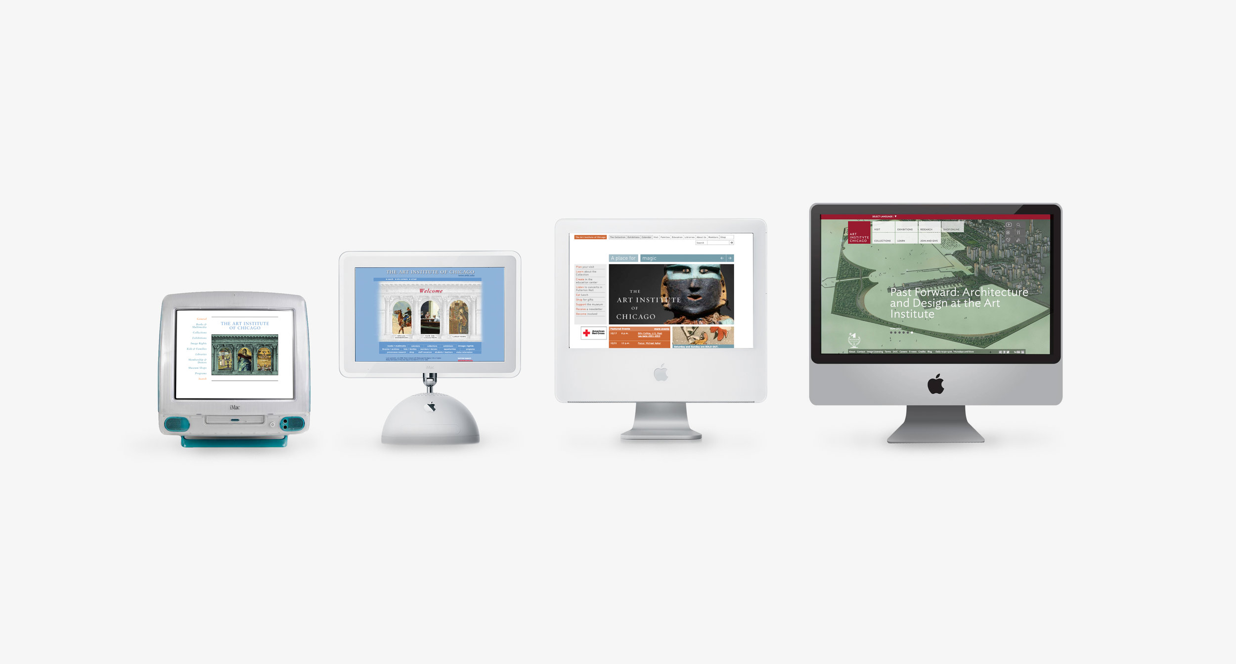
The Art Institute of Chicago’s first website was designed in 1995. It had information for prospective visitors, event details, exhibition promotions, and explained the highlights of our Collection which were organized by curatorial department.
Even with several iterations of the website between then and now—and the addition of mountains of content and plug-ins—little had changed to what was driving the spirit of the site, especially in relation to the Collection. See these two screen shots, from our site in 1999 to the last rendition of our site before the redesign nearly ten years later to see my point:
In other words, we knew that taking on this project would mean more than a simple design re-skinning. To capture the experience we wanted, we were going to do a full upheaval: an entire cleanup of our content and data, an audit and simplification of our tech systems and information architecture, a design system that could make our site evolve consistently, and an experience-focused concept that would reflect the Art Institute’s point-of-view.
Three years after my first day on the project, the website is finally live.

At the heart of the site is our Collection, now able to be searched accurately and browsed delightfully. Unpacking the artwork from their departmental silos and displaying them side-by-side shows the full encyclopedic volume and diversity, or as our mission states “Art of Our Time, Art of All Time”.
The artwork that appears at the root of the unfiltered Collection page is weighted in response to popularity of page visits, democratizing the results to show our most prominent icons.
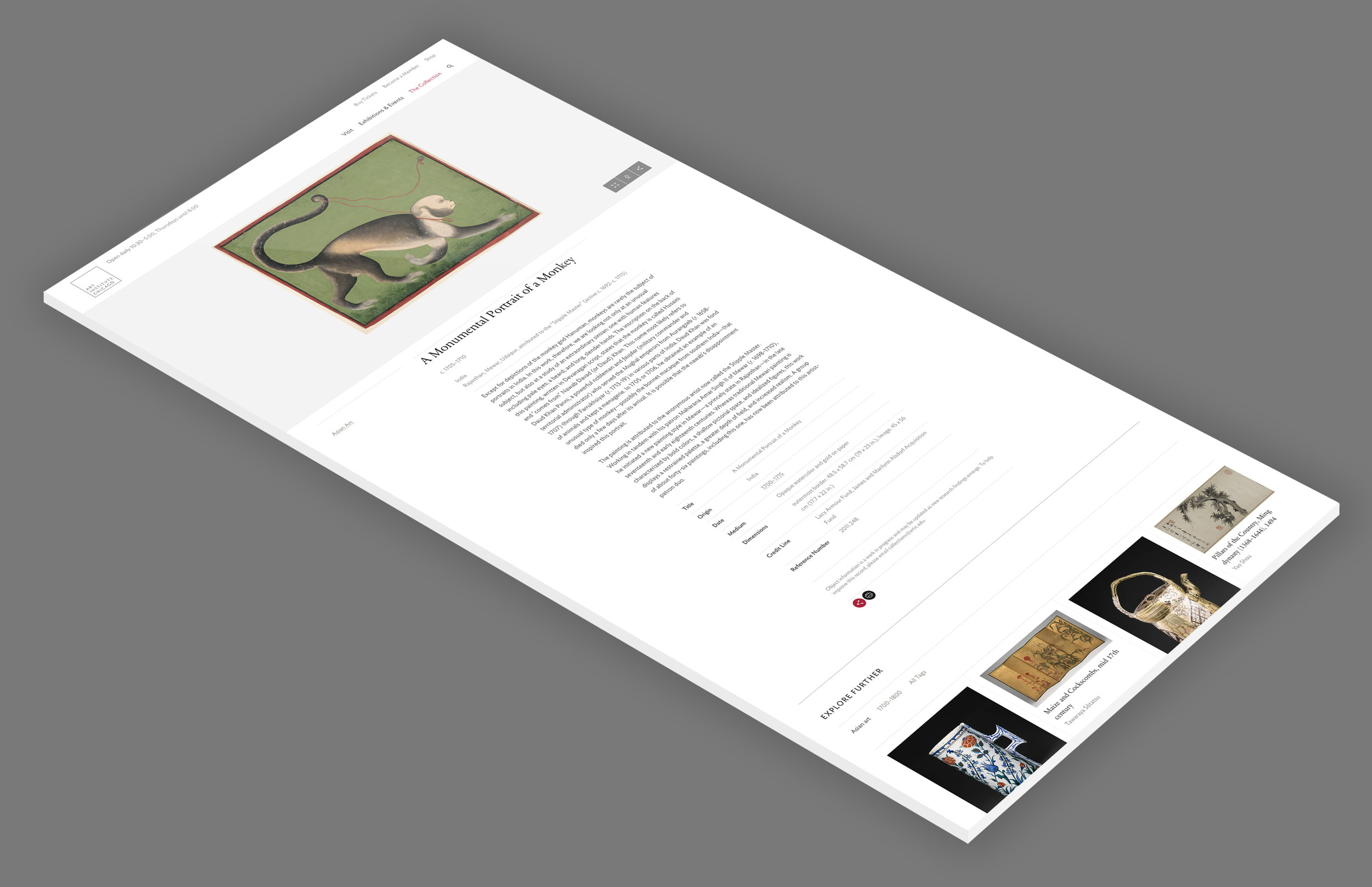
On the artwork page itself, the image of the work takes center stage. With this redesign we added 44,313 images to the public domain, inviting users to explore artwork imagery—and download them for their own creative uses—at a higher fidelity than ever before.
At the end of the page is the ability to Explore Further. Drawing from the same data constellations used in the Collections search, the page surfaces tags and other artworks related to that topic, eliminating dead ends and encouraging unlikely discovery.

To make space for these stories and more, we restructured the site to have spaces for narrative content. One of the two ways we did this were through creating Highlights pages, a visual assembly of artworks united by an overarching theme. The Highlights pages are meant to be image dominant, with text used to connect the ideas that the images illuminate.
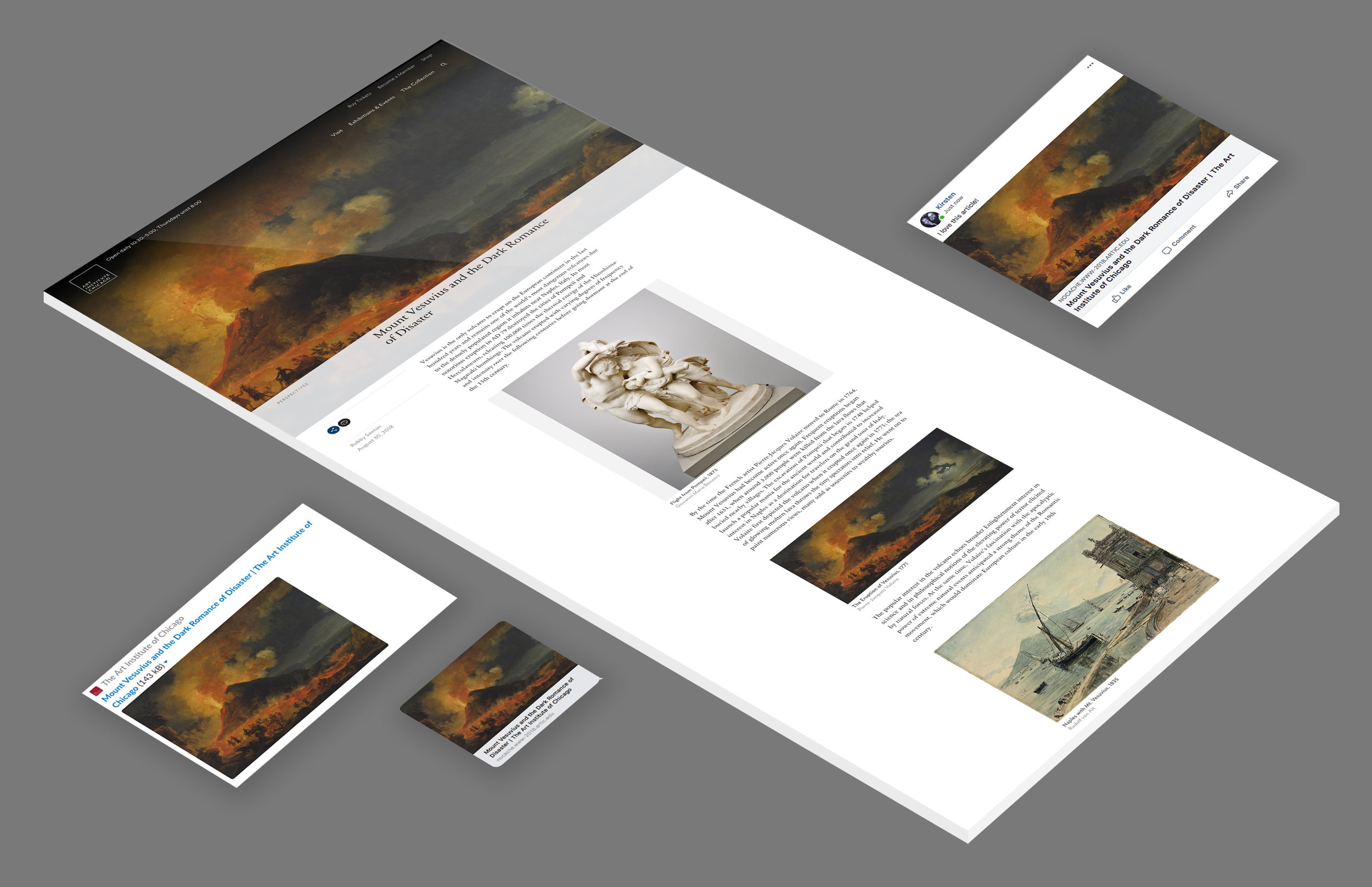
The counterpart to the Highlights pages are Articles pages, designed to capture topics in-depth and explore questions worth provoking discussion. For this reason, we ensured that these pages—and all others on the site—were optimized for previewing on social media and other platforms such as Slack and iMessage.
Providing access to artwork is not the only function of the site. A large percentage of our web traffic are potential visitors, looking for the logistical information on how to visit, pathways to buying tickets, and insight into exhibitions and events they won’t want to miss.
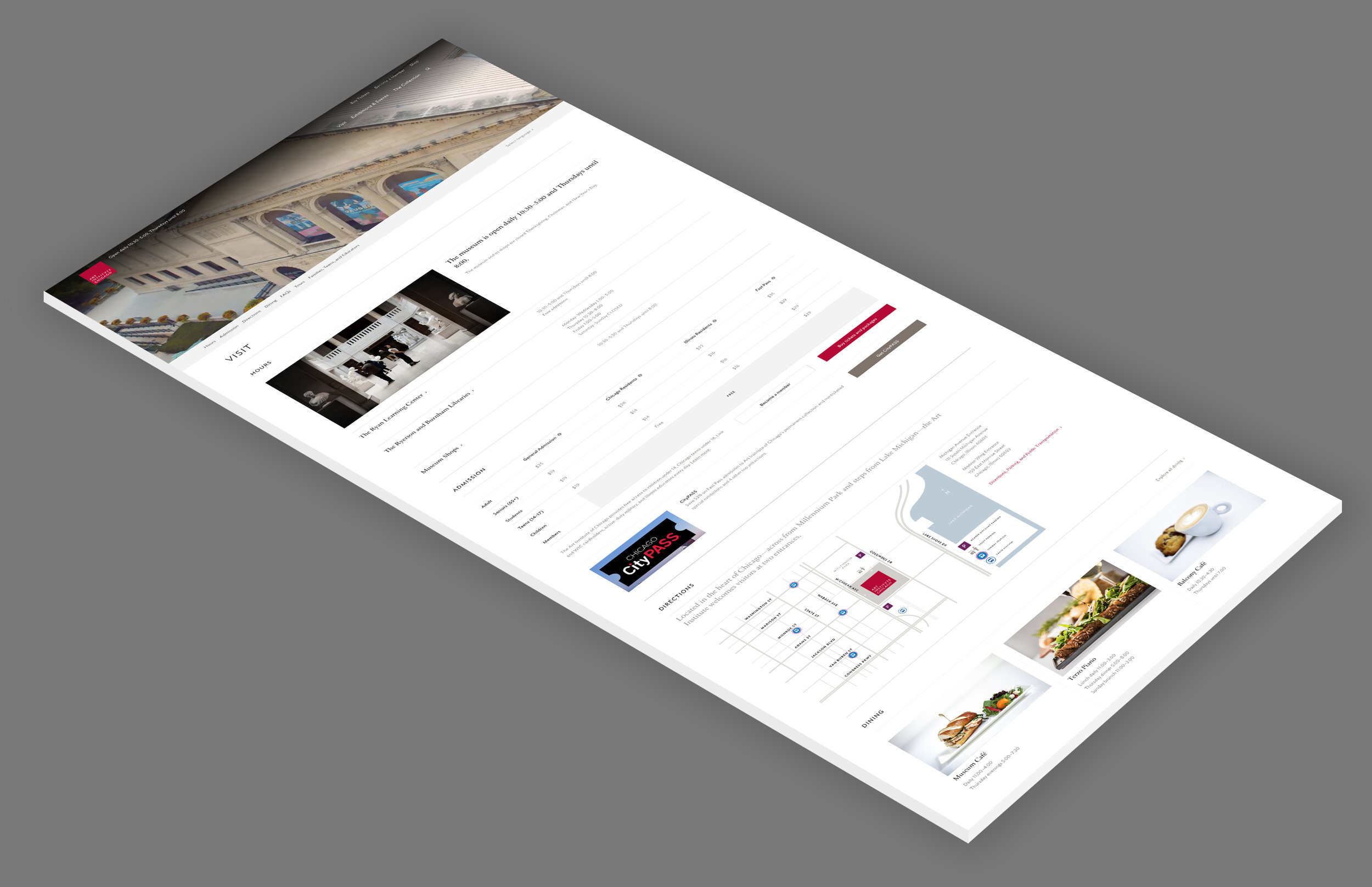
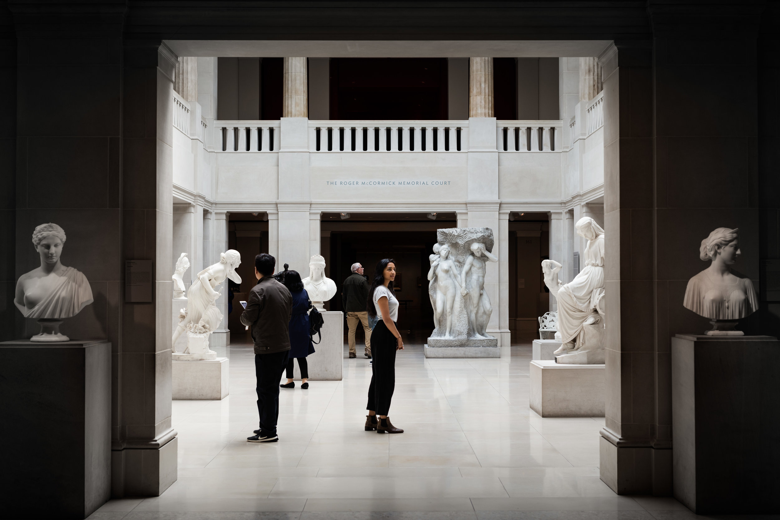
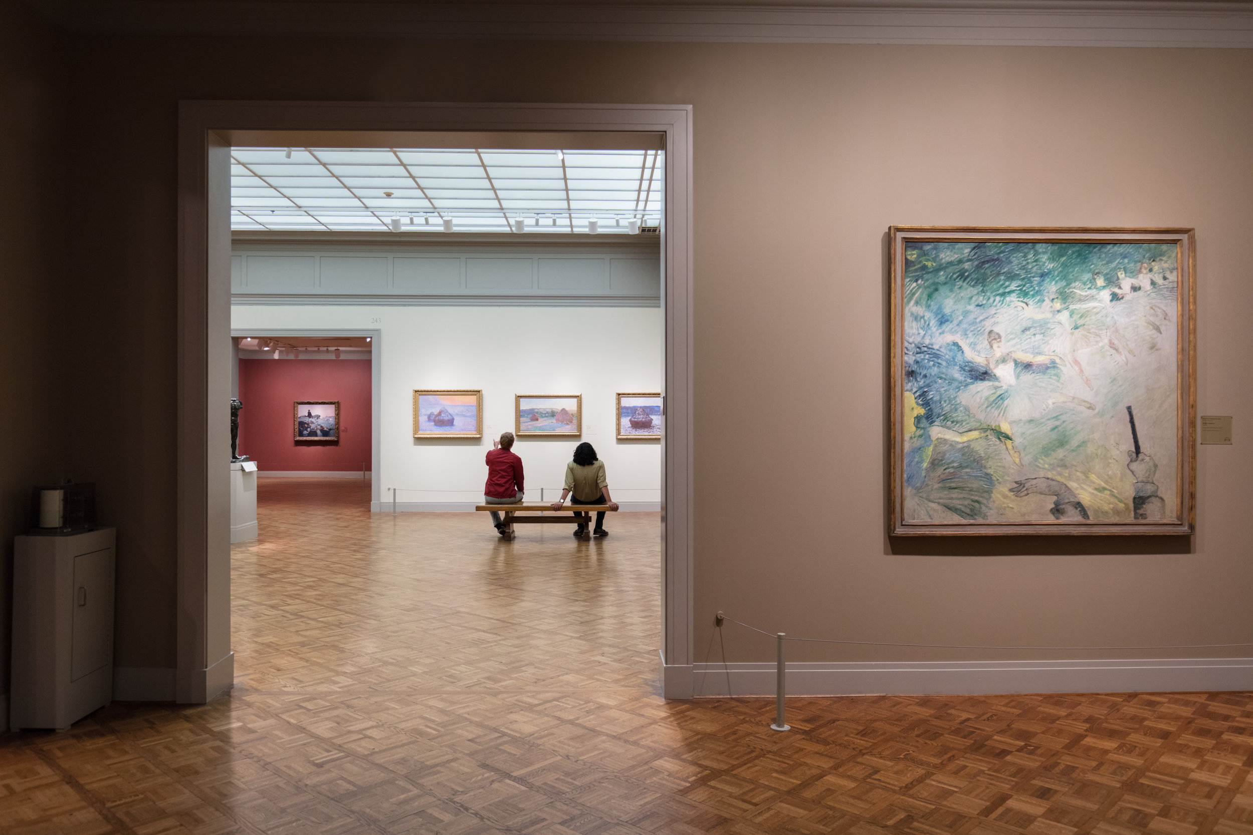
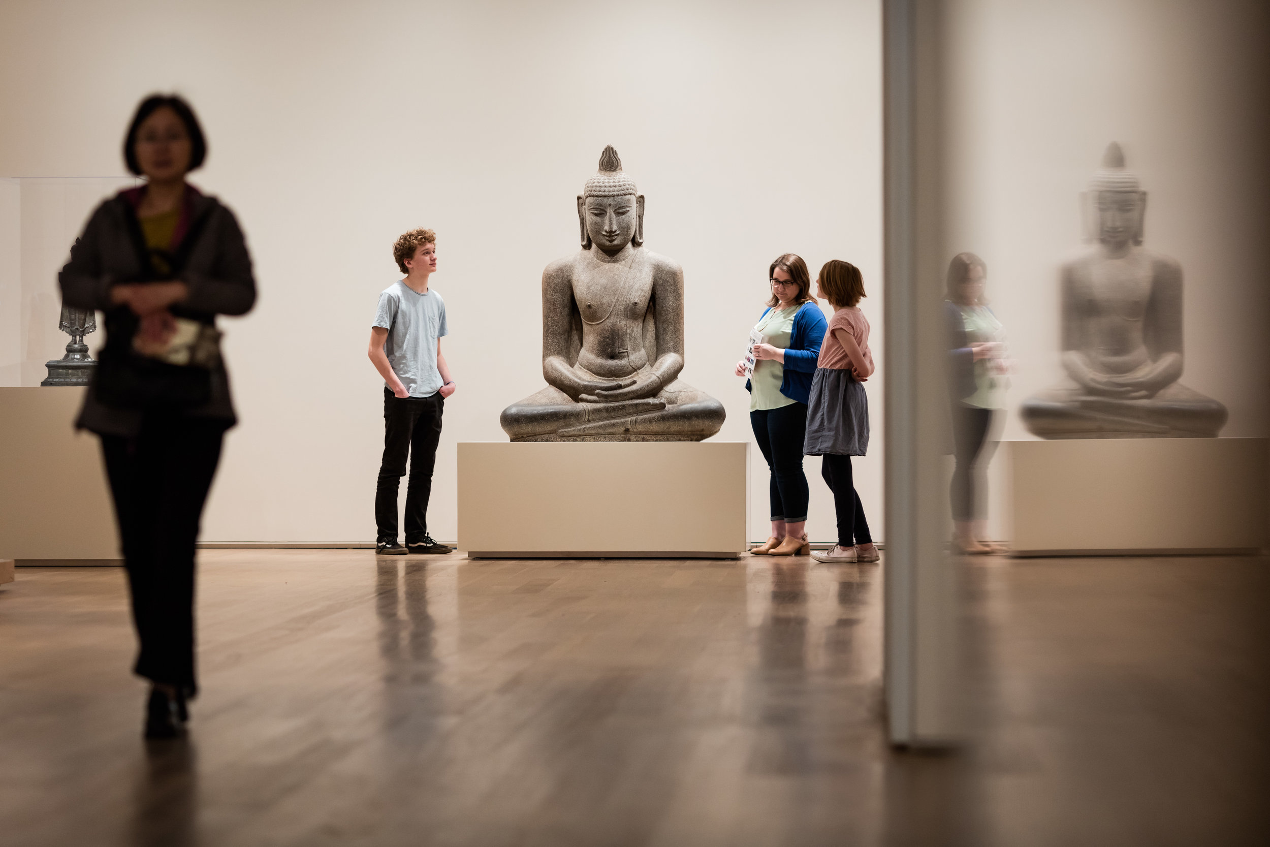
The goal of the Visit page is to provide all the necessary information while advertising a sense of what it felt like to be physically present at the museum. This brought up a whole new challenge: there was no consistency to the quality of images we had on our site. And perhaps more startling, we rarely—if ever—featured pictures of the museum that had actual people in them. Inspired by this need, our team was asked to curate the best of the best images from our entire image library and creative direct a new suite of images, specifically intended for the website.


In addition to the flexibility for how you can view the site, we have two new systems in place that will enable us to easily evolve our website for years to come. Our partners at Area17 designed and built our website on top of an open source content management system they created called Twill. This CMS means that the bulk of website updates—such as copy edits, event maintenance, and page composition—can be managed by several people across the museum, democratizing the effort and freeing up our team to focus on larger updates to the functionality and design of the site.
The other tool we now have at the ready is a meticulous design system, which is a code-centric documentation of all the aesthetic building blocks of the website. This design system is the key for consistent, seamless design implementation across all digital products (such as the redesigned Museum Shop website).
With these two systems, we not only have a great website, but everything in place to rapidly improve it as we move forward.
All of this work is a love letter to the excellence of the artwork we love within our Collection. The Art Institute of Chicago is synonymous with creative prestige, and our web experience should match exactly that. Now, you can zoom in to study the tedious beadwork of ceremonial artifacts, search our decades of research related to Vincent Van Gogh, and read about the gruesome influences of Ivan Albright without ever stepping foot in Chicago.
PROCESS
On my first day working at the museum, my premiere assignment was to write a project plan for a discovery phase of the website redesign, which at that point only included the Collections portion of the website.
The discovery phase of the project opened up broader questions about our intentions for the art we collect, our point of view on how we research and interpret artwork, and what differentiated our museum from other institutions. The goal of these inquiries was to define a concept that would be true to the Art Institute, and stay true as the website would eventually evolve.
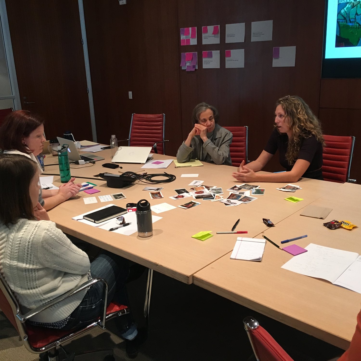
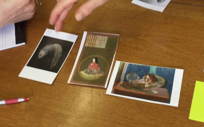
We conducted work sessions with every curatorial and staff department at the museum. Mixing staff from different curatorial departments, we would then ask them to play games to try to find unexpected relationships between pieces of artwork across the Collection. These conversations lead to much of the initial thinking for how we imagined visitors could discover new artwork on the website.
We also needed a way to collect swaths of opinions about the future of our website. Our team created a workbook that had screen grabs of different museum websites that they were likely familiar with. On these pages, staff were encouraged to comment on the things they liked and didn’t like about these websites. This was a strategic way to remove their biases from the concreteness of our current website and to think more creatively about realistic possibilities.


The information from these work sessions, and other informational meetings from the discovery phase, were collected into a Request for Proposals (RFP) which we invited design agencies around the country to respond to. After selecting Area17, our team provided creative direction and on the ground problem solving for topics and issues that required a more intimate knowledge of the content or technology.
For example, here’s a content audit I conducted that mapped the types of content on each page, color-coded to represent where that image, copy, or data was stored in our technical systems.

Once Area17 handed off the shell of the website, it was up to our team to organize the workflows to get all of the content of all of the pages into the site. On top of this operational challenge of organizing work groups and facilitating new processes, we also worked to adjust and troubleshoot a mountain of changes that revealed themselves once we were working intimately with the site.
At this point, my role turned to becoming the design system expert and advocate, creating rules and standards to help guide consistent decision making as we built out the pages and updating the system documentation so that we could track changes into the future.
This is the role that I will continue to grow into at the museum. The website is the most up-to-date and complete expression of the museum brand, and will be our North Star as we reposition other arms of our visual design, including print and environmental graphics.
PROJECT TEAM
The museum’s Communications and Marketing teams who tediously reviewed the direction of every page of the website, and re-wrote most of the website copy as a result. They will continue to manage the content of the website with it’s launch.
Experience Design Producer Kelly McHugh, now at the Museum of Science and Industry, who used her expertise of both content strategy and museum experience to play a heavy hand in the discovery phase and define a direction for the structure of several key elements of the website, most notably the artwork pages.
Director of Collections Becca Doll, who created a strategy for how our artwork data and visual assets could be organize to make all the functions of the site possible, and more impressively, motivated the entirety of museum staff to do their part.
Developers Nikhil Trivedi and Illya Moskvin who built a bulletproof data hub and bringing so much necessary 12th hour positive energy that brought us over the finish line as we took over development at the end of Area17’s contract.
Project Manager Josh Andrews who courageously threw himself at every challenge and inch of unchartered territory including but not limited to: technical issues, content alignment and management, design direction, and quality assurance.
Executive Creative Director of Experience Design Michael Neault who, to my daily admiration, had what appeared to be endless stamina to bring thoughtful care to any and every detail, no matter how small, all the way to the end. He lead this project with the full trust of his team and unwavering optimism day in and out, despite the fact that no one of us had ever taken on a project of this ilk.
Area17 who designed and developed the site, including the design system and the content management system.
Donald Richardson and Angela Chen who conducted design and tech audits that immediately followed the discovery phase and helped us align internally before engaging Area17.