Every day, thousands of people come to the Art Institute of Chicago, a massive encyclopedic art museum on the lakefront of downtown Chicago, to see iconic works that span over 5,000 years of creativity and craft. Many people describe the experience of being at the museum as spiritual, attributed to the power of being in the presence of irreplaceable artwork.
While there is no way to completely experience the museum without being physically present there, it surprises many to know that even if they’ve studied every one of our 200+ gallery spaces, they’ve hardly scratched the surface of the entirety of the museum’s full art collection. The museum, even at it’s massive scale, can only display between 12-15% of the Collection on any given day, meaning the bulk of our artwork resides in storage, is under repair by conservators, or on loan to other entities.
Herein was the challenge that sparked our redesign of the museum website. The depth of our Collection—which houses over 100,000 works—can only be accessed digitally, yet could we translate the ethereal experience of being in our museum to our website?
![]() The Art Institute of Chicago’s first website was designed in 1995. It had information for prospective visitors, event details, exhibition promotions, and explained the highlights of our Collection which were organized by curatorial department.
The Art Institute of Chicago’s first website was designed in 1995. It had information for prospective visitors, event details, exhibition promotions, and explained the highlights of our Collection which were organized by curatorial department.
Even with several iterations of the website between then and now—and the addition of mountains of content and plug-ins—little had changed to what was driving the spirit of the site, especially in relation to the Collection. See these two screen shots, from our site in 1999 to the last rendition of our site before the redesign nearly ten years later to see my point:
In other words, we knew that taking on this project would mean more than a simple design re-skinning. To capture the experience we wanted, we were going to do a full upheaval: an entire cleanup of our content and data, an audit and simplification of our tech systems and information architecture, a design system that could make our site evolve consistently, and an experience-focused concept that would reflect the Art Institute’s point-of-view.
Three years after my first day on the project, the website is finally live.
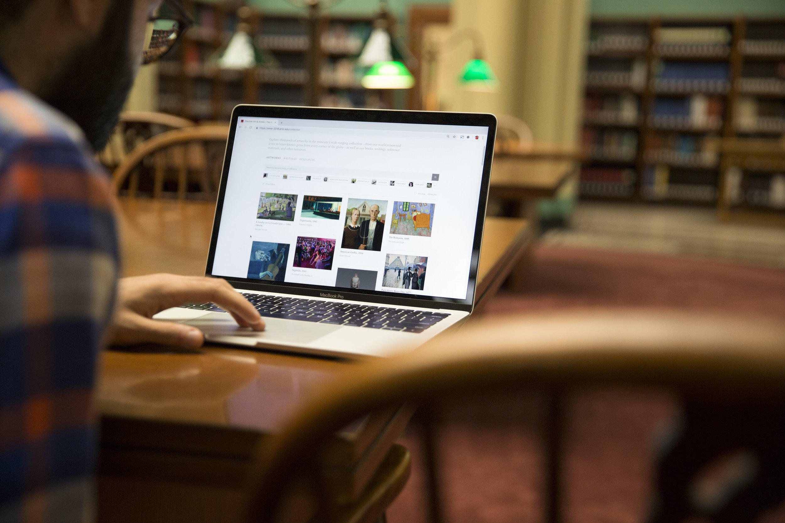
![]() At the heart of the site is our Collection, now able to be searched accurately and browsed delightfully. Unpacking the artwork from their departmental silos and displaying them side-by-side shows the full encyclopedic volume and diversity, or as our mission states “Art of Our Time, Art of All Time”.
At the heart of the site is our Collection, now able to be searched accurately and browsed delightfully. Unpacking the artwork from their departmental silos and displaying them side-by-side shows the full encyclopedic volume and diversity, or as our mission states “Art of Our Time, Art of All Time”.
The artwork that appears at the root of the unfiltered Collection page is weighted in response to popularity of page visits, democratizing the results to show our most prominent icons.
![]() To surface artworks that are less visited, quick-search terms provide an accessible foothold, curating assortments within the Collection. This also acts as a low-barrier way to humanize aspects of the artwork, drawing unconventional parallels between works and educating visitors on movements and themes that have prevailed across time and place.
To surface artworks that are less visited, quick-search terms provide an accessible foothold, curating assortments within the Collection. This also acts as a low-barrier way to humanize aspects of the artwork, drawing unconventional parallels between works and educating visitors on movements and themes that have prevailed across time and place.
![]() On the artwork page itself, the image of the work takes center stage. With this redesign we added 44,313 images to the public domain, inviting users to explore artwork imagery—and download them for their own creative uses—at a higher fidelity than ever before.
On the artwork page itself, the image of the work takes center stage. With this redesign we added 44,313 images to the public domain, inviting users to explore artwork imagery—and download them for their own creative uses—at a higher fidelity than ever before.
At the end of the page is the ability to Explore Further. Drawing from the same data constellations used in the Collections search, the page surfaces tags and other artworks related to that topic, eliminating dead ends and encouraging unlikely discovery.
![]() One of the biggest foundational adjustments we made in this redesign was reconsidering where stories were being told on the site. Up until this redesign, the artwork page carried the burden for all of the interpretive content on our website. This made it difficult to find a home for information that covered topics broader than what related to the immediate work of art. Where could we talk about conservation, a specific art movement, or the creative practices that have spanned art history?
One of the biggest foundational adjustments we made in this redesign was reconsidering where stories were being told on the site. Up until this redesign, the artwork page carried the burden for all of the interpretive content on our website. This made it difficult to find a home for information that covered topics broader than what related to the immediate work of art. Where could we talk about conservation, a specific art movement, or the creative practices that have spanned art history?
To make space for these stories and more, we restructured the site to have spaces for narrative content. One of the two ways we did this were through creating Highlights pages, a visual assembly of artworks united by an overarching theme. The Highlights pages are meant to be image dominant, with text used to connect the ideas that the images illuminate.
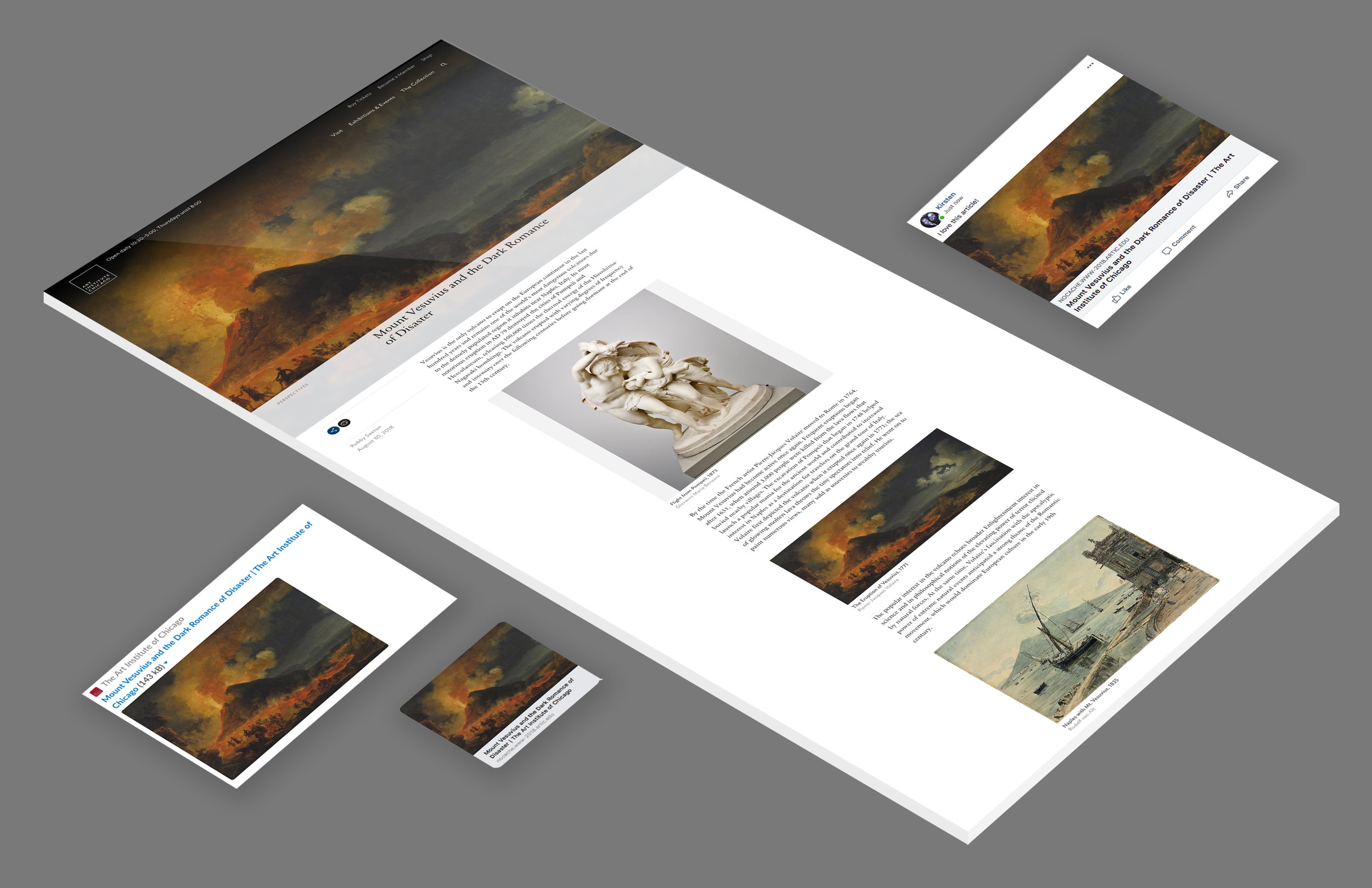
![]() The counterpart to the Highlights pages are Articles pages, designed to capture topics in-depth and explore questions worth provoking discussion. For this reason, we ensured that these pages—and all others on the site—were optimized for previewing on social media and other platforms such as Slack and iMessage.
The counterpart to the Highlights pages are Articles pages, designed to capture topics in-depth and explore questions worth provoking discussion. For this reason, we ensured that these pages—and all others on the site—were optimized for previewing on social media and other platforms such as Slack and iMessage.
Providing access to artwork is not the only function of the site. A large percentage of our web traffic are potential visitors, looking for the logistical information on how to visit, pathways to buying tickets, and insight into exhibitions and events they won’t want to miss.
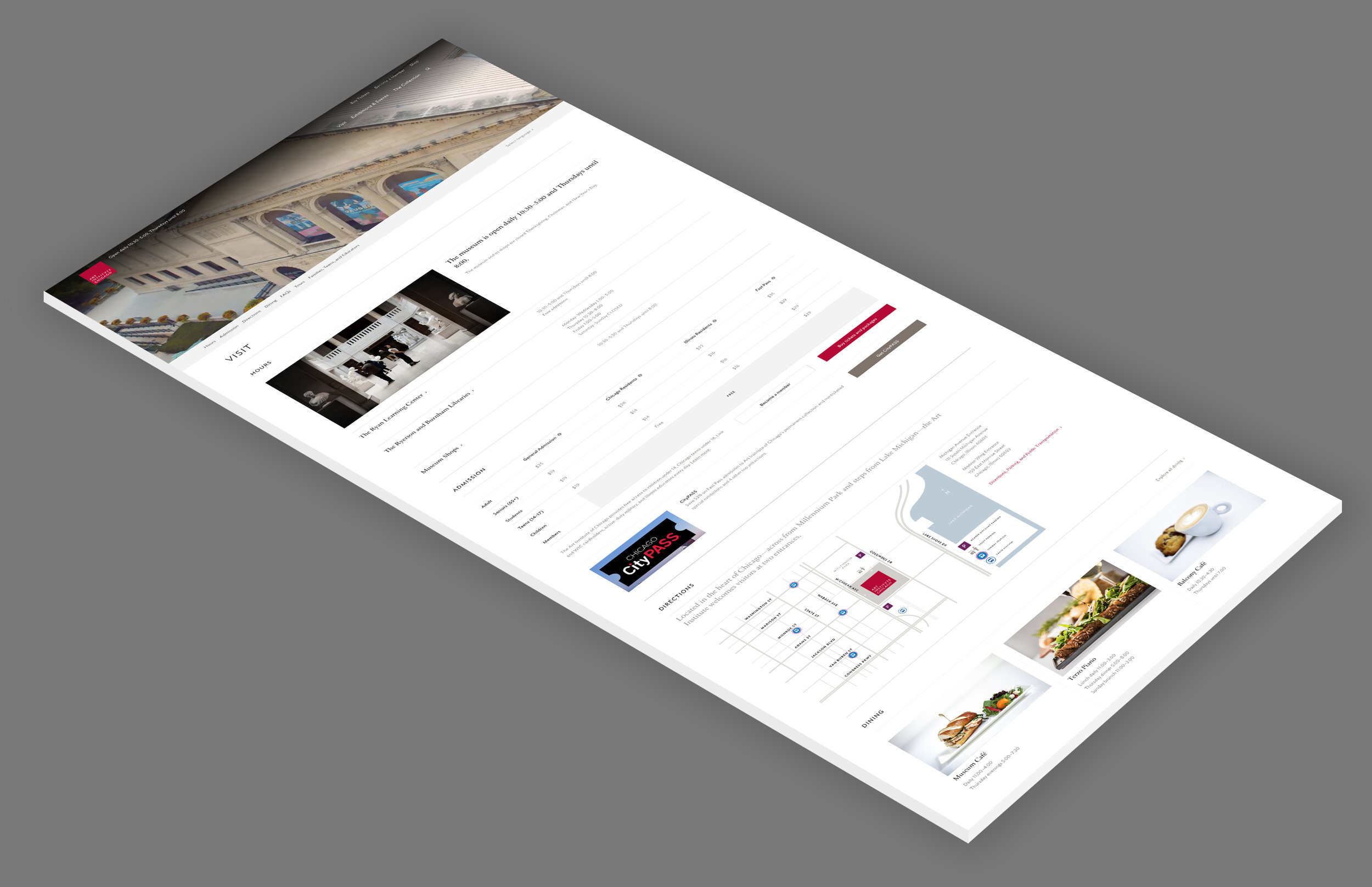
![]() The goal of the Visit page is to provide all the necessary information while advertising a sense of what it felt like to be physically present at the museum. This brought up a whole new challenge: there was no consistency to the quality of images we had on our site. And perhaps more startling, we rarely—if ever—featured pictures of the museum that had actual people in them. Inspired by this need, our team was asked to curate the best of the best images from our entire image library and creative direct a new suite of images, specifically intended for the website.
The goal of the Visit page is to provide all the necessary information while advertising a sense of what it felt like to be physically present at the museum. This brought up a whole new challenge: there was no consistency to the quality of images we had on our site. And perhaps more startling, we rarely—if ever—featured pictures of the museum that had actual people in them. Inspired by this need, our team was asked to curate the best of the best images from our entire image library and creative direct a new suite of images, specifically intended for the website.
Our team often describes the website redesign as a new vocabulary or language, as we have a whole set of systems that we can use to connect and communicate with our visitors. For example, the responsive design enables new contexts for accessing the site. Now, it is easy to learn more about an artwork, event, or exhibition from your phone. Imagine how we might use this to reach visitors that are on site at the museum.
![]() In addition to the flexibility for how you can view the site, we have two new systems in place that will enable us to easily evolve our website for years to come. Our partners at Area17 designed and built our website on top of an open source content management system they created called Twill. This CMS means that the bulk of website updates—such as copy edits, event maintenance, and page composition—can be managed by several people across the museum, democratizing the effort and freeing up our team to focus on larger updates to the functionality and design of the site.
In addition to the flexibility for how you can view the site, we have two new systems in place that will enable us to easily evolve our website for years to come. Our partners at Area17 designed and built our website on top of an open source content management system they created called Twill. This CMS means that the bulk of website updates—such as copy edits, event maintenance, and page composition—can be managed by several people across the museum, democratizing the effort and freeing up our team to focus on larger updates to the functionality and design of the site.
The other tool we now have at the ready is a meticulous design system, which is a code-centric documentation of all the aesthetic building blocks of the website. This design system is the key for consistent, seamless design implementation across all digital products (such as the redesigned Museum Shop website).
With these two systems, we not only have a great website, but everything in place to rapidly improve it as we move forward.
All of this work is a love letter to the excellence of the artwork we love within our Collection. The Art Institute of Chicago is synonymous with creative prestige, and our web experience should match exactly that. Now, you can zoom in to study the tedious beadwork of ceremonial artifacts, search our decades of research related to Vincent Van Gogh, and read about the gruesome influences of Ivan Albright without ever stepping foot in Chicago.
![]() The new shop website mirrors many aspects of the new Art Institute website—generous negative space, big images, and quick-search terms for browsing the assortment that align with the aesthetic values of the shoppers. While we were able to use the design and functionality of the Art Institute website as a jumping off point, we wanted the shop to have it’s own distinct feel, and to conceptually challenge ourselves into thinking about how the values of our museum should translate into an e-commerce experience.
The new shop website mirrors many aspects of the new Art Institute website—generous negative space, big images, and quick-search terms for browsing the assortment that align with the aesthetic values of the shoppers. While we were able to use the design and functionality of the Art Institute website as a jumping off point, we wanted the shop to have it’s own distinct feel, and to conceptually challenge ourselves into thinking about how the values of our museum should translate into an e-commerce experience.
![]() A main tenant of the site was getting shoppers to seeing product sooner. This meant having an accessible product stream immediately on the homepage, as well as having narrative-focused banner ads that reveal content and product teasers before advancing the user to another page.
A main tenant of the site was getting shoppers to seeing product sooner. This meant having an accessible product stream immediately on the homepage, as well as having narrative-focused banner ads that reveal content and product teasers before advancing the user to another page.
These banner ads are a manifestation of one of the more informative insights from our strategy: stories that highlight the maker’s process or the museum shop’s exclusive relationship with the maker were the biggest appeal for shoppers. This strategy permeates several areas of the site, including an “Exclusives” page in the main nav that surfaces all of the products you can only find at the Art Institute of Chicago’s museum shop.
Another area this is prominent is on the product page itself. If there is a related story—about the maker, the artistic inspiration, or the trend which the product aligns with—it appears adjacent to the product. Clicking through to the story, shoppers can read more about the topic and see all of the related products immediately on the page.
![]()
The museum shop website was once considered decisively separate from the museum. However, with its evolution, its strategy changed into trying to integrate as much as possible to be seen as adjacent to the prestige of the museum and it’s iconic collection.
The website had been designed, built, and maintained since it’s inception by a local agency called Webitects. Webitects’ nimble team acted as our development partners on the project, while our team—specifically, myself and Director of Experience Design Michael Neault—owned the new design.
While we had often had the opportunity to bring our expertise to experiences that were digital and highly narrative, we very infrequently face challenges that have the quantifiable return of investment that can be seen in the design choices of an e-commerce site.
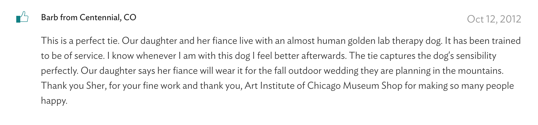
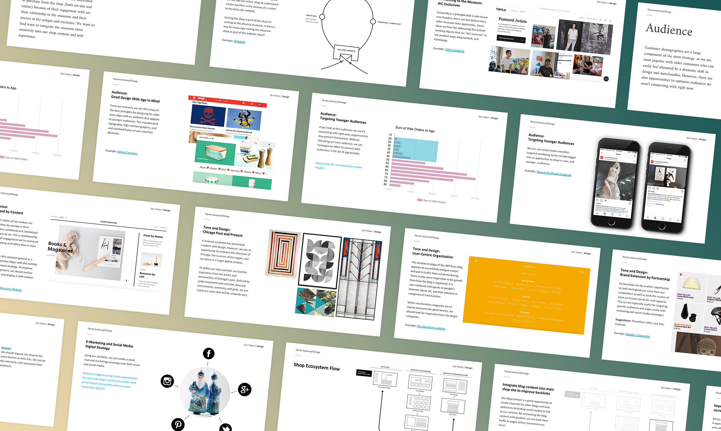
The context for the museum shop makes it an interesting subject for research. Shoppers had an intensely personal connection to the shop, mostly evident through the incredibly heartfelt comments that can be found on the product pages across the site.
![]() So, we did a deep dive on who the shoppers were. The shop had been collecting exhaustive data for years, revealing a crowd that was skewed older (with the greatest percentage of shoppers over the age of 60) and often projected their support for the museum—and the arts as a whole—into their shopping experience.
So, we did a deep dive on who the shoppers were. The shop had been collecting exhaustive data for years, revealing a crowd that was skewed older (with the greatest percentage of shoppers over the age of 60) and often projected their support for the museum—and the arts as a whole—into their shopping experience.
We defined a strategy that would help us grow our audience with younger segments, while not isolating our core shoppers. While this had implications for how the site would look and function, it also revealed that the admiration for visual art as the obvious overlap of the thresholds of our shoppers.
![]()
Coming out of our strategy research, we decided that we could roll out a new design incrementally, allowing us to programmatically experiment with different functions while we waited for the final Art Institute of Chicago website designs to be settled.
![An evolution of the shop website, from Summer 2017 to Fall of 2018.]() The first phase of the shop redesign was addressing all of the most urgent design and user experience issues and starting to line up the workflow to accommodate what would be the new design. New art direction was issued to product photographers while the shop adjusted their content strategy.
The first phase of the shop redesign was addressing all of the most urgent design and user experience issues and starting to line up the workflow to accommodate what would be the new design. New art direction was issued to product photographers while the shop adjusted their content strategy.
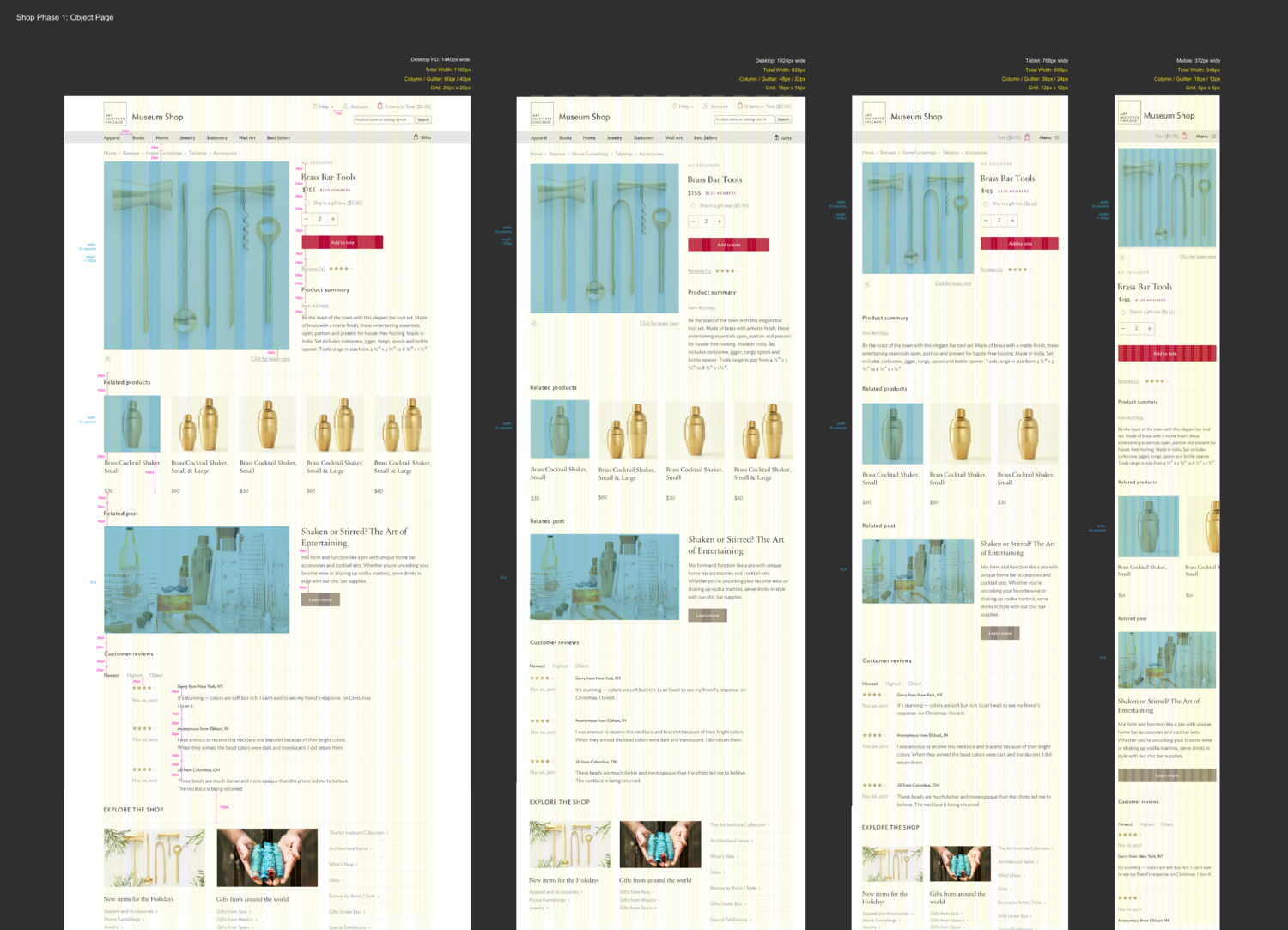
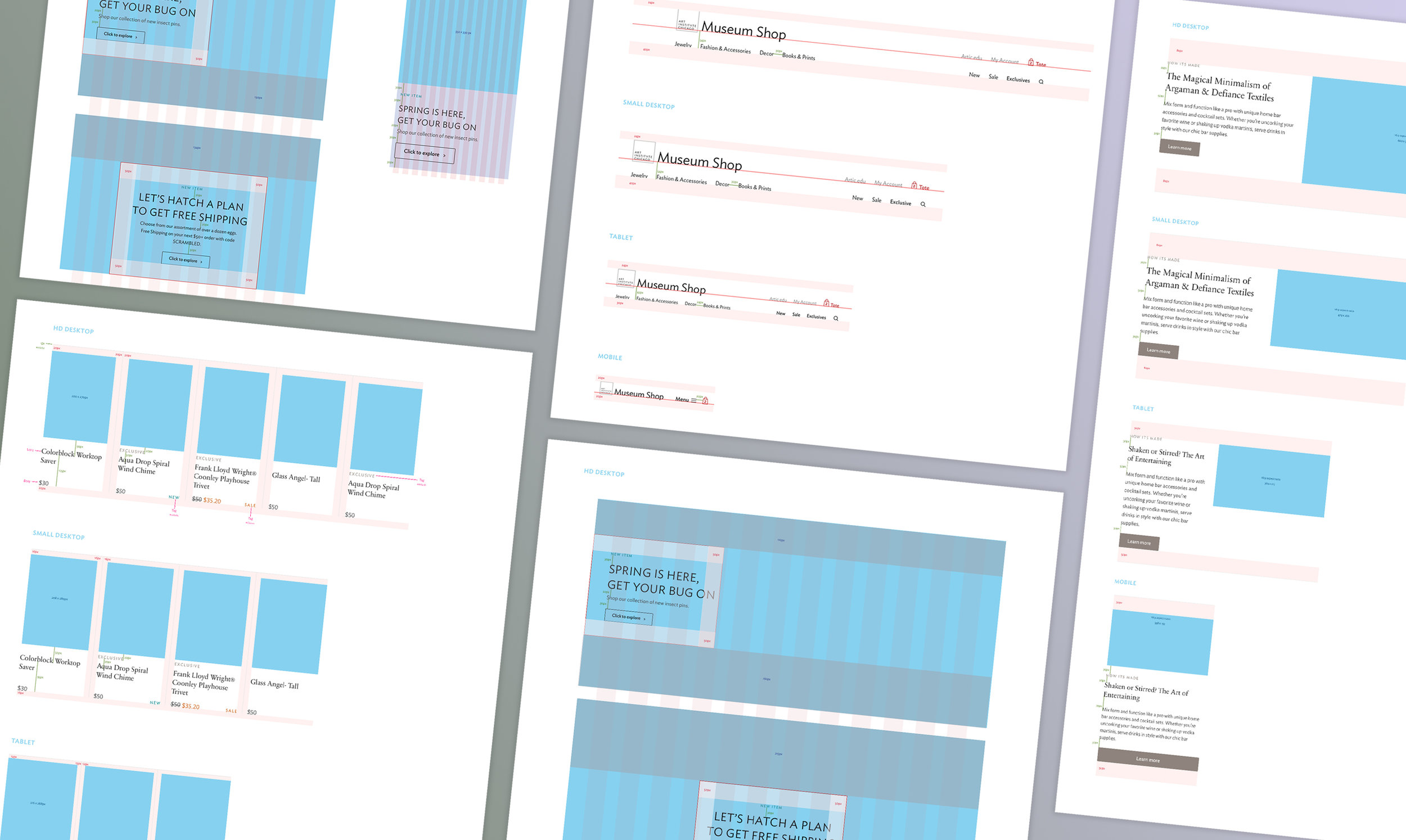
With the final Art Institute website designs in place, we leveraged our new digital design system to bring consistency across the two sites. The visual design decisions were communicated to our Webitects through Sketch files and thorough design documentation, such as this comp that demonstrated the composition, styles, and spacing as the page was scaled responsively.
![]()
This documentation, and the dozens of hours of subsequent VQA, were the most diligent work that I had ever done on a visual design project. In order to anticipate how the design would be implemented, I needed a thorough understanding of how Webitects was planning to build the site. Similar to the Art Institute website, the content was considered atomically, with modules of content that had different scales and manifestations throughout the site.
![]() In the end, the vigor that was brought to the shop redesign paid off, as I was able to use the site design as the first extension of the design system as defined by the Art Institute website. The intuition I gained on the brand language would pay off as we made updates to the main website, allowing me to spot inaccuracies and effortlessly reference other areas of the two sites to use as precedent for updates.
In the end, the vigor that was brought to the shop redesign paid off, as I was able to use the site design as the first extension of the design system as defined by the Art Institute website. The intuition I gained on the brand language would pay off as we made updates to the main website, allowing me to spot inaccuracies and effortlessly reference other areas of the two sites to use as precedent for updates.
The shop now has it’s own visual identity, manifested through the shop website and documented to use for future design needs, whether in print or environmentally within the shop. The shop now visually complements and aligns with the museum’s identity, allowing those who feel connected to the Art Institute to bring a the spirit of the Collection home with them.
![]()
While there is no way to completely experience the museum without being physically present there, it surprises many to know that even if they’ve studied every one of our 200+ gallery spaces, they’ve hardly scratched the surface of the entirety of the museum’s full art collection. The museum, even at it’s massive scale, can only display between 12-15% of the Collection on any given day, meaning the bulk of our artwork resides in storage, is under repair by conservators, or on loan to other entities.
Herein was the challenge that sparked our redesign of the museum website. The depth of our Collection—which houses over 100,000 works—can only be accessed digitally, yet could we translate the ethereal experience of being in our museum to our website?
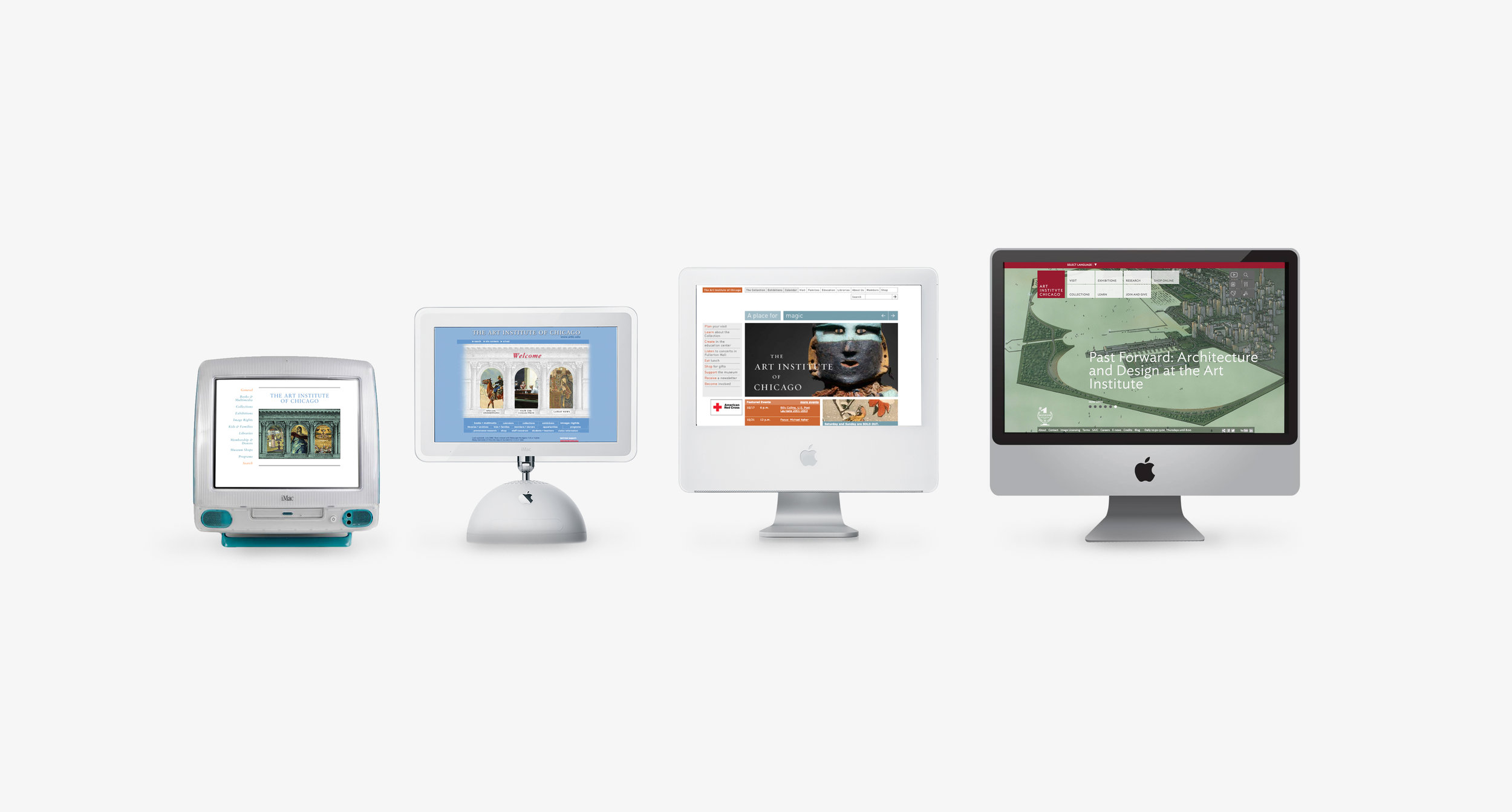 The Art Institute of Chicago’s first website was designed in 1995. It had information for prospective visitors, event details, exhibition promotions, and explained the highlights of our Collection which were organized by curatorial department.
 Even with several iterations of the website between then and now—and the addition of mountains of content and plug-ins—little had changed to what was driving the spirit of the site, especially in relation to the Collection. See these two screen shots, from our site in 1999 to the last rendition of our site before the redesign nearly ten years later to see my point:
In other words, we knew that taking on this project would mean more than a simple design re-skinning. To capture the experience we wanted, we were going to do a full upheaval: an entire cleanup of our content and data, an audit and simplification of our tech systems and information architecture, a design system that could make our site evolve consistently, and an experience-focused concept that would reflect the Art Institute’s point-of-view.
Three years after my first day on the project, the website is finally live.
 At the heart of the site is our Collection, now able to be searched accurately and browsed delightfully. Unpacking the artwork from their departmental silos and displaying them side-by-side shows the full encyclopedic volume and diversity, or as our mission states “Art of Our Time, Art of All Time”.
The artwork that appears at the root of the unfiltered Collection page is weighted in response to popularity of page visits, democratizing the results to show our most prominent icons.
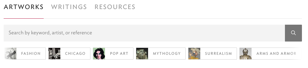 To surface artworks that are less visited, quick-search terms provide an accessible foothold, curating assortments within the Collection. This also acts as a low-barrier way to humanize aspects of the artwork, drawing unconventional parallels between works and educating visitors on movements and themes that have prevailed across time and place.
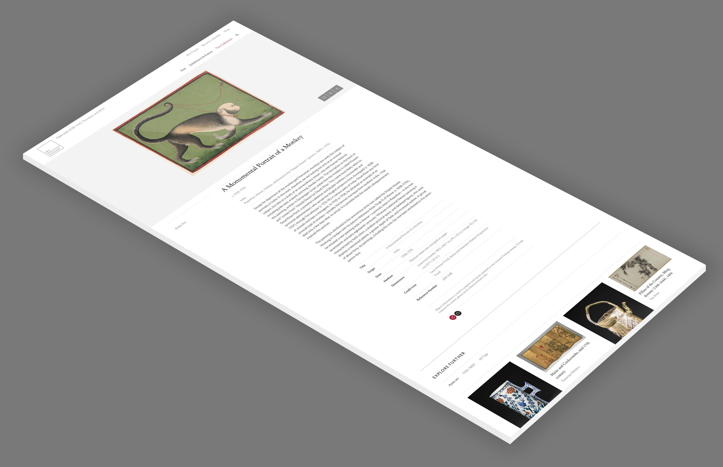 On the artwork page itself, the image of the work takes center stage. With this redesign we added 44,313 images to the public domain, inviting users to explore artwork imagery—and download them for their own creative uses—at a higher fidelity than ever before.
 At the end of the page is the ability to Explore Further. Drawing from the same data constellations used in the Collections search, the page surfaces tags and other artworks related to that topic, eliminating dead ends and encouraging unlikely discovery.
 One of the biggest foundational adjustments we made in this redesign was reconsidering where stories were being told on the site. Up until this redesign, the artwork page carried the burden for all of the interpretive content on our website. This made it difficult to find a home for information that covered topics broader than what related to the immediate work of art. Where could we talk about conservation, a specific art movement, or the creative practices that have spanned art history?
To make space for these stories and more, we restructured the site to have spaces for narrative content. One of the two ways we did this were through creating Highlights pages, a visual assembly of artworks united by an overarching theme. The Highlights pages are meant to be image dominant, with text used to connect the ideas that the images illuminate.
 The counterpart to the Highlights pages are Articles pages, designed to capture topics in-depth and explore questions worth provoking discussion. For this reason, we ensured that these pages—and all others on the site—were optimized for previewing on social media and other platforms such as Slack and iMessage.
Providing access to artwork is not the only function of the site. A large percentage of our web traffic are potential visitors, looking for the logistical information on how to visit, pathways to buying tickets, and insight into exhibitions and events they won’t want to miss.
 The goal of the Visit page is to provide all the necessary information while advertising a sense of what it felt like to be physically present at the museum. This brought up a whole new challenge: there was no consistency to the quality of images we had on our site. And perhaps more startling, we rarely—if ever—featured pictures of the museum that had actual people in them. Inspired by this need, our team was asked to curate the best of the best images from our entire image library and creative direct a new suite of images, specifically intended for the website.
Our team often describes the website redesign as a new vocabulary or language, as we have a whole set of systems that we can use to connect and communicate with our visitors. For example, the responsive design enables new contexts for accessing the site. Now, it is easy to learn more about an artwork, event, or exhibition from your phone. Imagine how we might use this to reach visitors that are on site at the museum.
 In addition to the flexibility for how you can view the site, we have two new systems in place that will enable us to easily evolve our website for years to come. Our partners at Area17 designed and built our website on top of an open source content management system they created called Twill. This CMS means that the bulk of website updates—such as copy edits, event maintenance, and page composition—can be managed by several people across the museum, democratizing the effort and freeing up our team to focus on larger updates to the functionality and design of the site.
The other tool we now have at the ready is a meticulous design system, which is a code-centric documentation of all the aesthetic building blocks of the website. This design system is the key for consistent, seamless design implementation across all digital products (such as the redesigned Museum Shop website).
With these two systems, we not only have a great website, but everything in place to rapidly improve it as we move forward.
All of this work is a love letter to the excellence of the artwork we love within our Collection. The Art Institute of Chicago is synonymous with creative prestige, and our web experience should match exactly that. Now, you can zoom in to study the tedious beadwork of ceremonial artifacts, search our decades of research related to Vincent Van Gogh, and read about the gruesome influences of Ivan Albright without ever stepping foot in Chicago.
 The new shop website mirrors many aspects of the new Art Institute website—generous negative space, big images, and quick-search terms for browsing the assortment that align with the aesthetic values of the shoppers. While we were able to use the design and functionality of the Art Institute website as a jumping off point, we wanted the shop to have it’s own distinct feel, and to conceptually challenge ourselves into thinking about how the values of our museum should translate into an e-commerce experience.
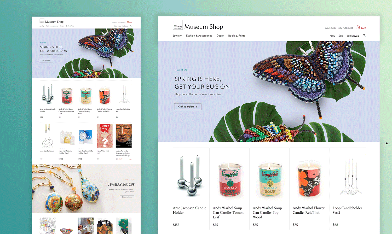 A main tenant of the site was getting shoppers to seeing product sooner. This meant having an accessible product stream immediately on the homepage, as well as having narrative-focused banner ads that reveal content and product teasers before advancing the user to another page.
These banner ads are a manifestation of one of the more informative insights from our strategy: stories that highlight the maker’s process or the museum shop’s exclusive relationship with the maker were the biggest appeal for shoppers. This strategy permeates several areas of the site, including an “Exclusives” page in the main nav that surfaces all of the products you can only find at the Art Institute of Chicago’s museum shop.
Another area this is prominent is on the product page itself. If there is a related story—about the maker, the artistic inspiration, or the trend which the product aligns with—it appears adjacent to the product. Clicking through to the story, shoppers can read more about the topic and see all of the related products immediately on the page.

The museum shop website was once considered decisively separate from the museum. However, with its evolution, its strategy changed into trying to integrate as much as possible to be seen as adjacent to the prestige of the museum and it’s iconic collection.
The website had been designed, built, and maintained since it’s inception by a local agency called Webitects. Webitects’ nimble team acted as our development partners on the project, while our team—specifically, myself and Director of Experience Design Michael Neault—owned the new design.
While we had often had the opportunity to bring our expertise to experiences that were digital and highly narrative, we very infrequently face challenges that have the quantifiable return of investment that can be seen in the design choices of an e-commerce site.
The context for the museum shop makes it an interesting subject for research. Shoppers had an intensely personal connection to the shop, mostly evident through the incredibly heartfelt comments that can be found on the product pages across the site.
 So, we did a deep dive on who the shoppers were. The shop had been collecting exhaustive data for years, revealing a crowd that was skewed older (with the greatest percentage of shoppers over the age of 60) and often projected their support for the museum—and the arts as a whole—into their shopping experience.
We defined a strategy that would help us grow our audience with younger segments, while not isolating our core shoppers. While this had implications for how the site would look and function, it also revealed that the admiration for visual art as the obvious overlap of the thresholds of our shoppers.
Coming out of our strategy research, we decided that we could roll out a new design incrementally, allowing us to programmatically experiment with different functions while we waited for the final Art Institute of Chicago website designs to be settled.
 The first phase of the shop redesign was addressing all of the most urgent design and user experience issues and starting to line up the workflow to accommodate what would be the new design. New art direction was issued to product photographers while the shop adjusted their content strategy.
With the final Art Institute website designs in place, we leveraged our new digital design system to bring consistency across the two sites. The visual design decisions were communicated to our Webitects through Sketch files and thorough design documentation, such as this comp that demonstrated the composition, styles, and spacing as the page was scaled responsively.
This documentation, and the dozens of hours of subsequent VQA, were the most diligent work that I had ever done on a visual design project. In order to anticipate how the design would be implemented, I needed a thorough understanding of how Webitects was planning to build the site. Similar to the Art Institute website, the content was considered atomically, with modules of content that had different scales and manifestations throughout the site.
 In the end, the vigor that was brought to the shop redesign paid off, as I was able to use the site design as the first extension of the design system as defined by the Art Institute website. The intuition I gained on the brand language would pay off as we made updates to the main website, allowing me to spot inaccuracies and effortlessly reference other areas of the two sites to use as precedent for updates.
The shop now has it’s own visual identity, manifested through the shop website and documented to use for future design needs, whether in print or environmentally within the shop. The shop now visually complements and aligns with the museum’s identity, allowing those who feel connected to the Art Institute to bring a the spirit of the Collection home with them.
